JESSIE WEBSTER /
Photography
.png)
.png)
To take this set of images I was heavily inspired by the work of Mark Mawson, whos work is seen above. I really liked the movement within each of his images and how bold the colours he uses are.
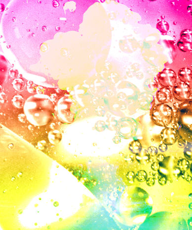
I used a clear bucket full of water and dropped a mix of watered down acrylic paint in a range of colours to try and get a similar effect to Maswon's work, almost creating a colourful expolsion underneath the waters surface
COLOURFUL EXPLOSIONS

The subject of this photo ( which is the cloud of defusing colour ) is directly in the centre of the image, allowing their to be a sort of symmetry within the image.
The is more contrast between the subject and the background on the lower half of the image allowing more details to be seen

The subject in this image is similar to the first image, but this time the background is white, allowing for more contrast.
Their is a rule of three for this pieces composition. The top third the colour is thinnest and in the bottom third its the widest and more prominent

The bottom half of this image has more contrast as the background is much lighter, allowing the details and swirling patterned to be seen much more easily than they can be in the top half

The way this image is composed gives it an almost mirrored feeling. This is because the widest areas of colour are at the very top and very bottom of the image, and the middle is much less dense. this creates an almost reflection
More colour
More colour
Less colour
Less colour
DEVELOPMENT


